Word By Word
EXHIBITION DESIGN, SKETCHUP, STORYTELLING, AFTER EFFECTS
Word by Word is a traveling exhibition educating high school students on book censorship in the United States.
PROBLEM SPACE
Across the U.S., high school students are increasingly denied access to important books on diverse topics. These include classics, unique narratives, and new perspectives. Restrictions by school boards, administrators, and some parental groups limit this exploration of history and ideas. These actions greatly threaten students’ intellectual freedom and educational growth.
EXHIBITION FEATURES
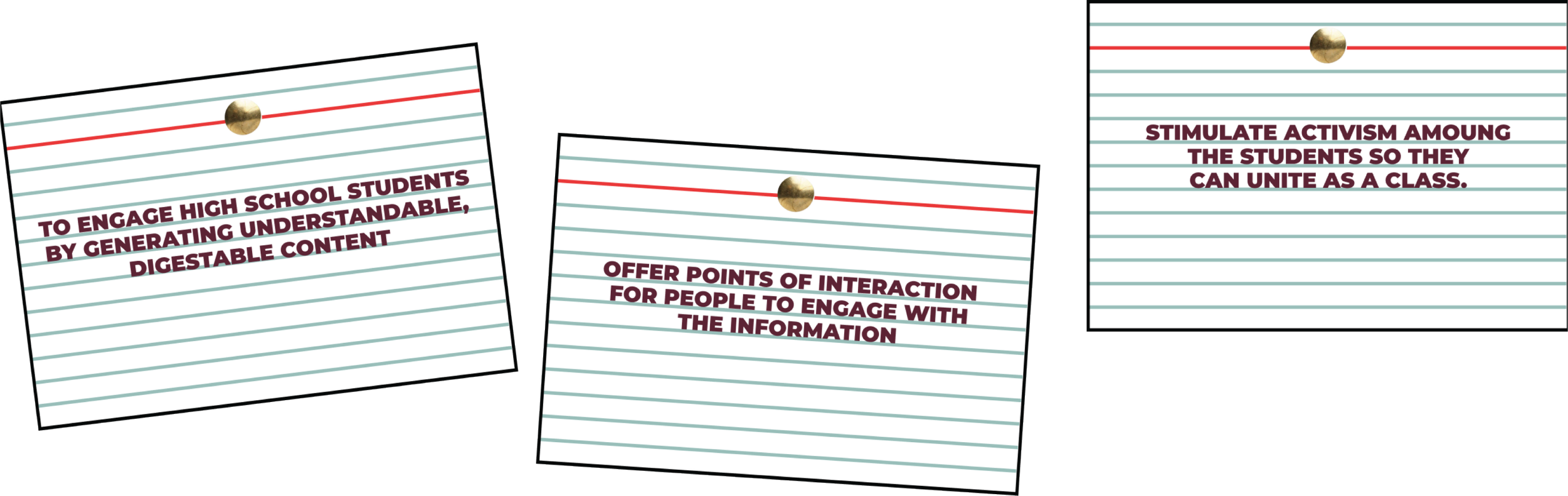
A list of defined categories or objectives that I wanted to come out of the exhibition design at hand.
DESIGN SOLUTION
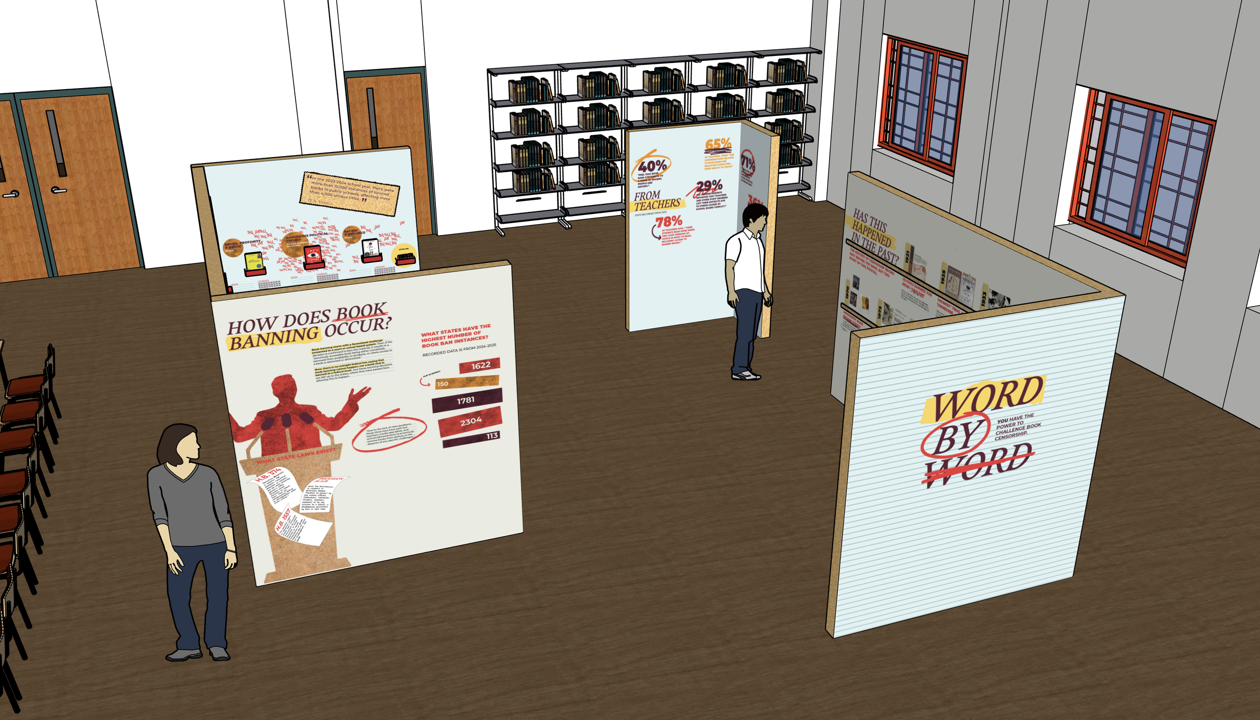
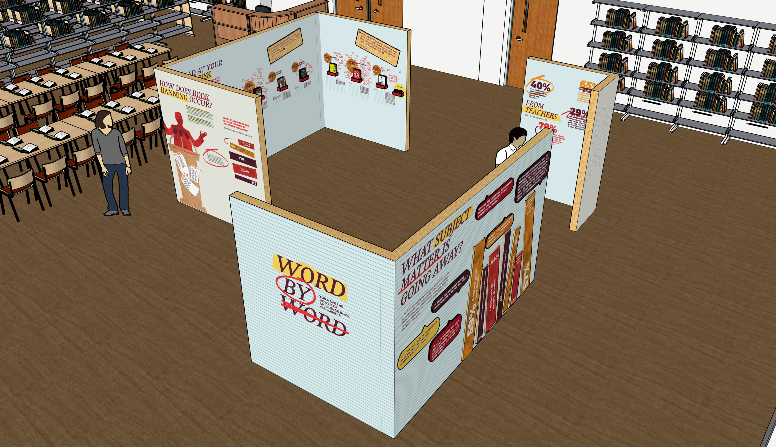
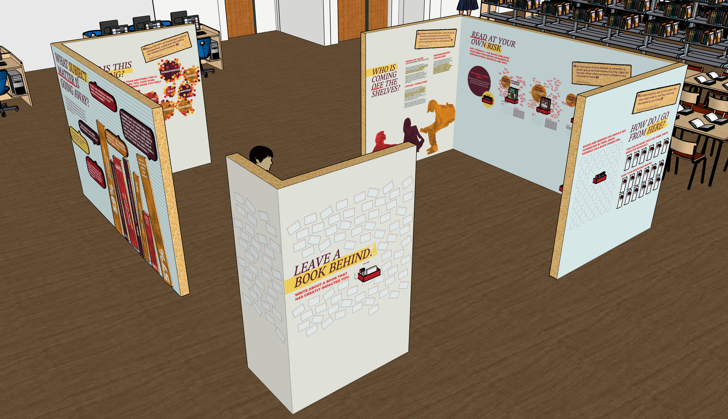
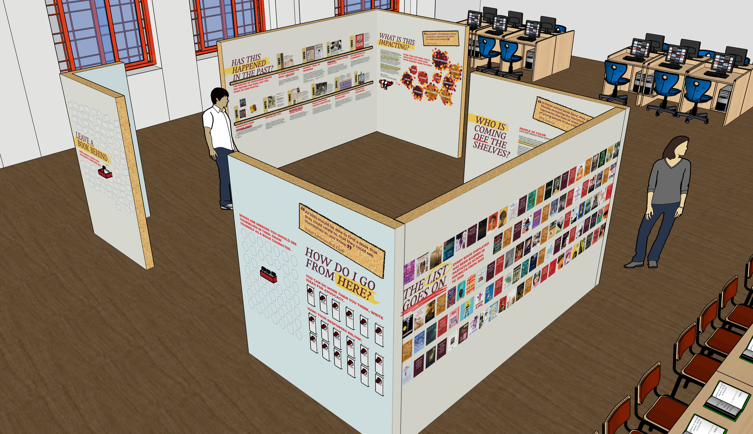
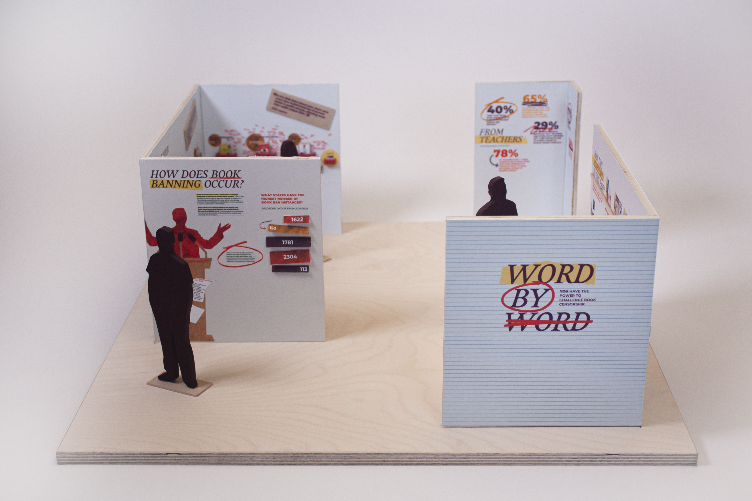
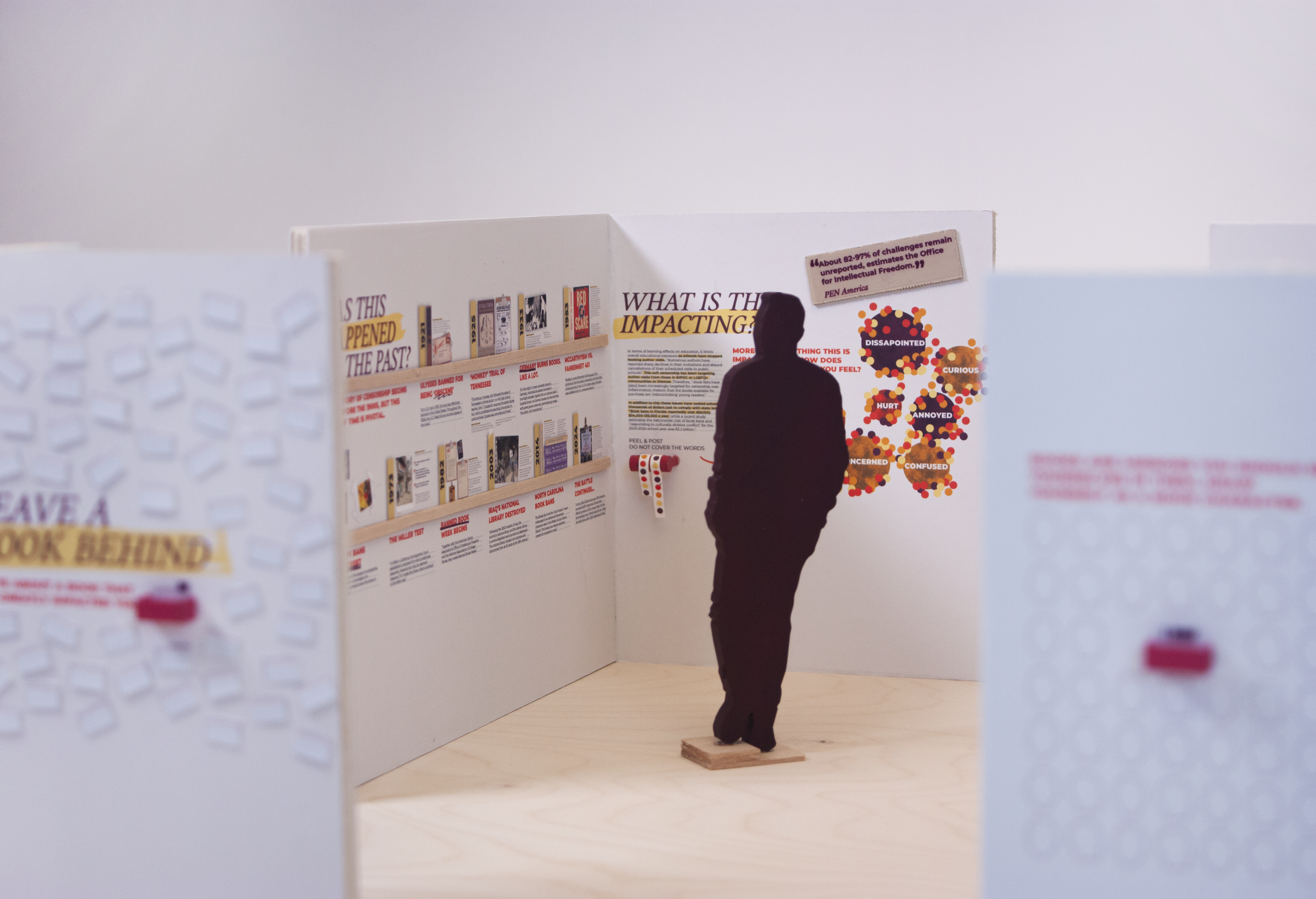
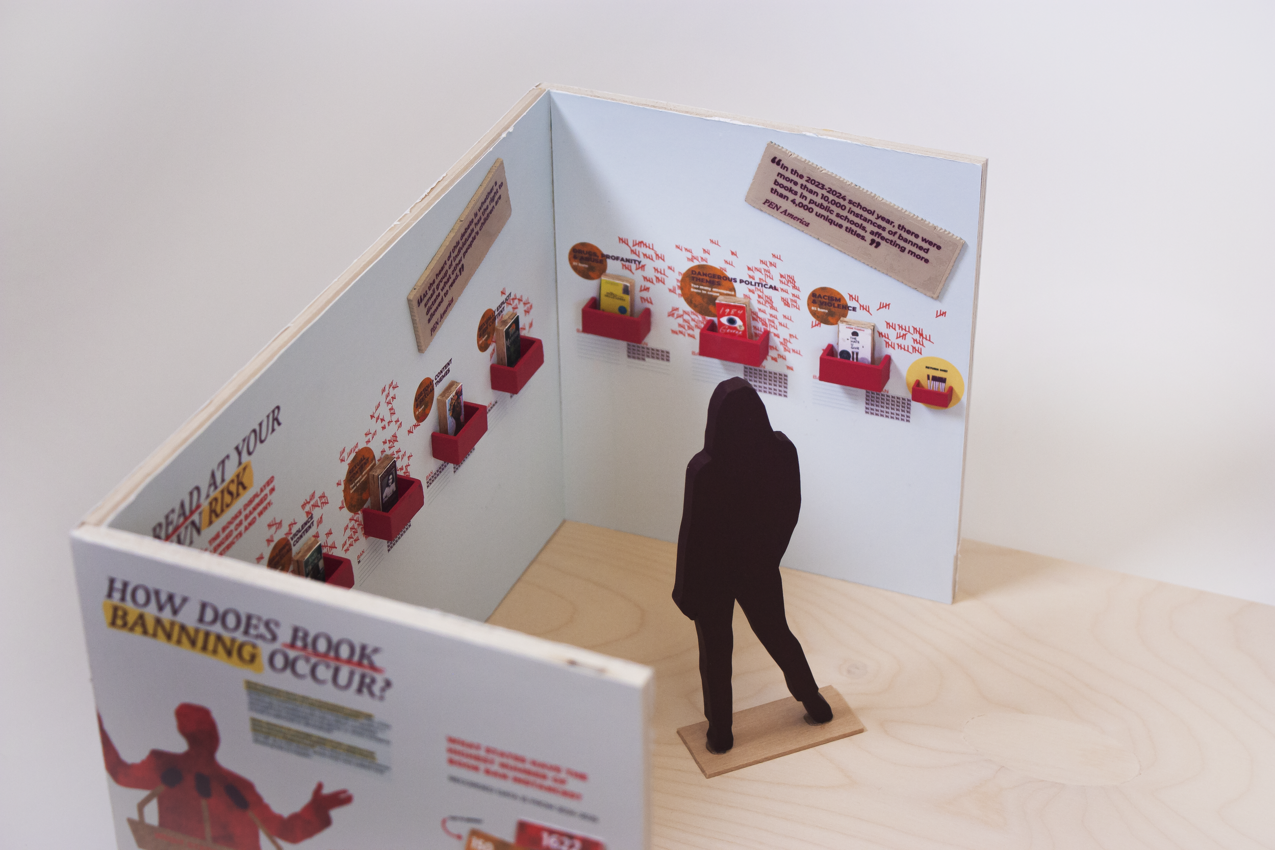
This exhibition design discusses the impact that book banning has on educational and personal growth for high school students. The exhibition guides students through the impacts of book banning and explains how this issue has evolved. To engage high school students throughout the exhibition, includes an emotional feedback wall, spaces to vote on book bans, revealing informational components, and walls to connect them as a community, so they can start to advocate on this issue.
PROCESS: PRIMARY RESEARCH & AUDIENCE DEFINITION
Given the context of censorship at hand, it is affecting a majority of titles that fall into the teen or young adult category. Therefore, in determining the audience for this exhibition, I decided to focus it on this category of readers, who are primarily in high school.
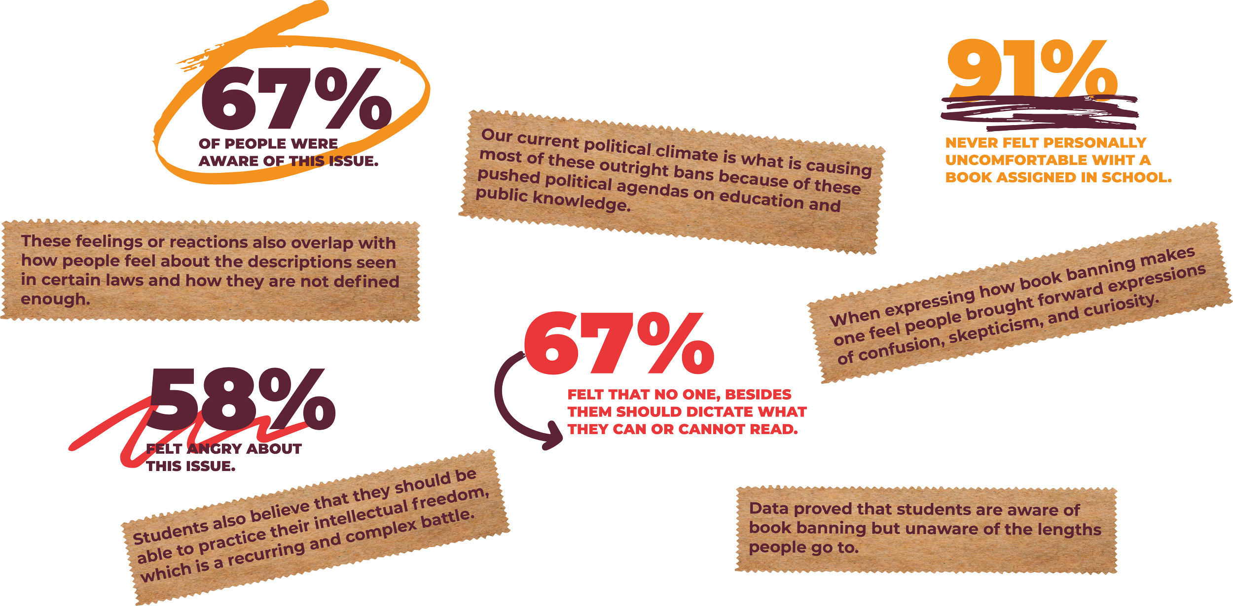
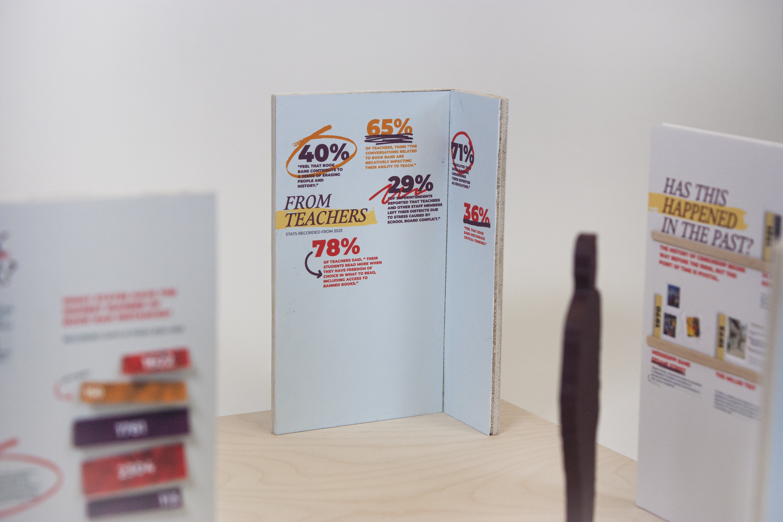
In understanding my audience better, I conducted a variety of interviews with not only high school students but also teachers, librarians, and a parent. In addition to this, in order to collect enough primary research data, I also gathered insights from a survey. Below are insights gathered from interviews.
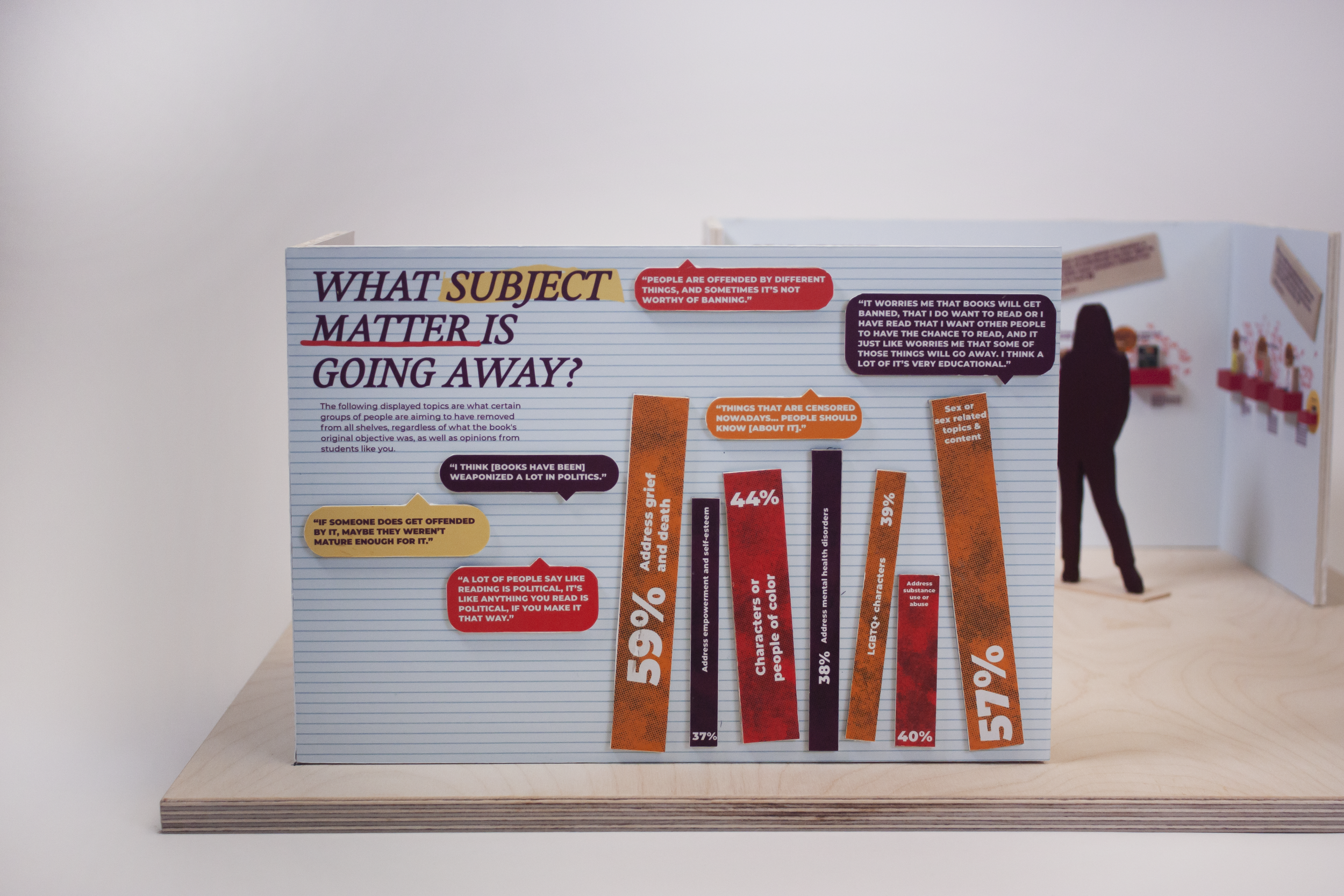
In other results collected to the best of their knowledge, they were asked to define what themes in literature are most commonly attacked right now. The top highlighted content was related to the representation of the LGBTQIA+ community, sexual material, race-related topics, and political subject matter.
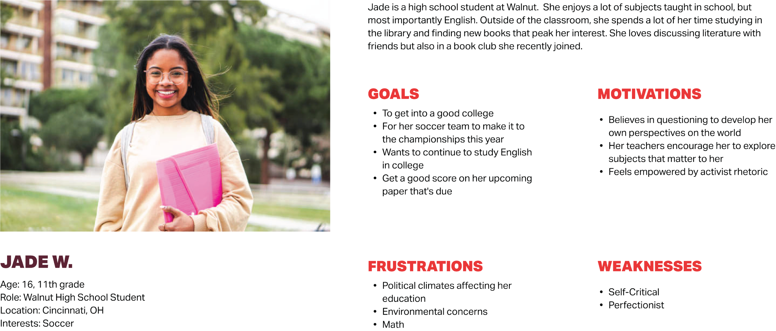
PROCESS: PERSONA
Developed based on primary research gathered from numerous interviews with high school students, teachers, librarians, and parents.
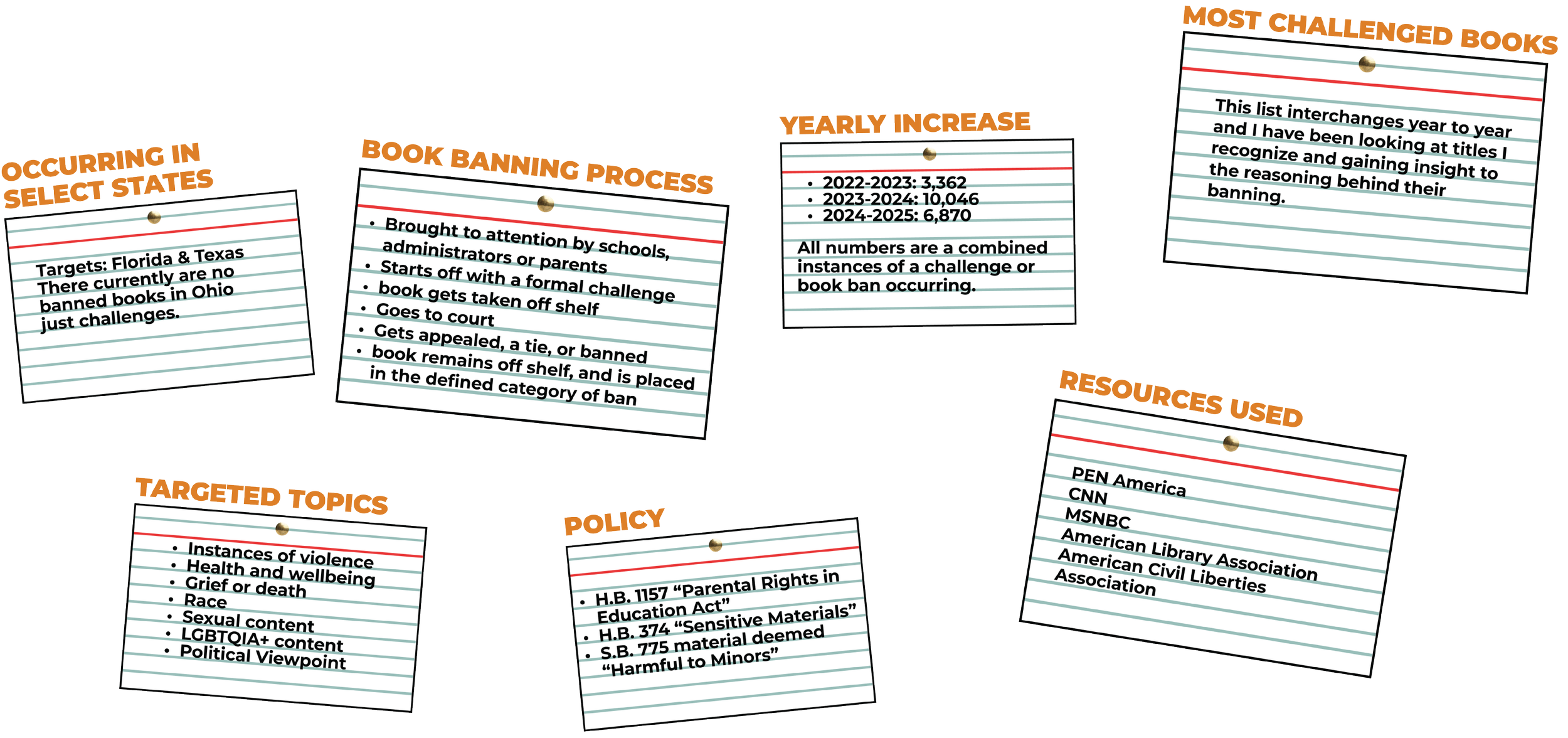
PROCESS: SECONDARY RESEARCH
In tandem with connecting with my selected audience, I was conducting secondary research to help generate my content for the exhibition.
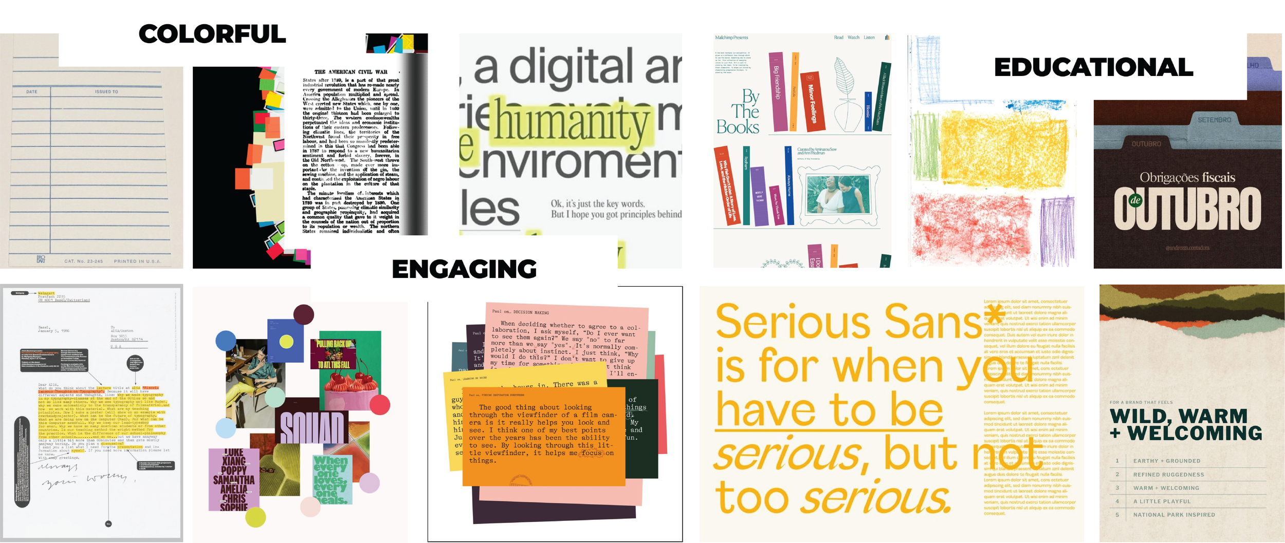
PROCESS: MOODBOARD
I wanted this exhibition to not only serve its educational component through the content and information displayed, but I also wanted the work to be engaging and for high school students to feel like they could connect to it.
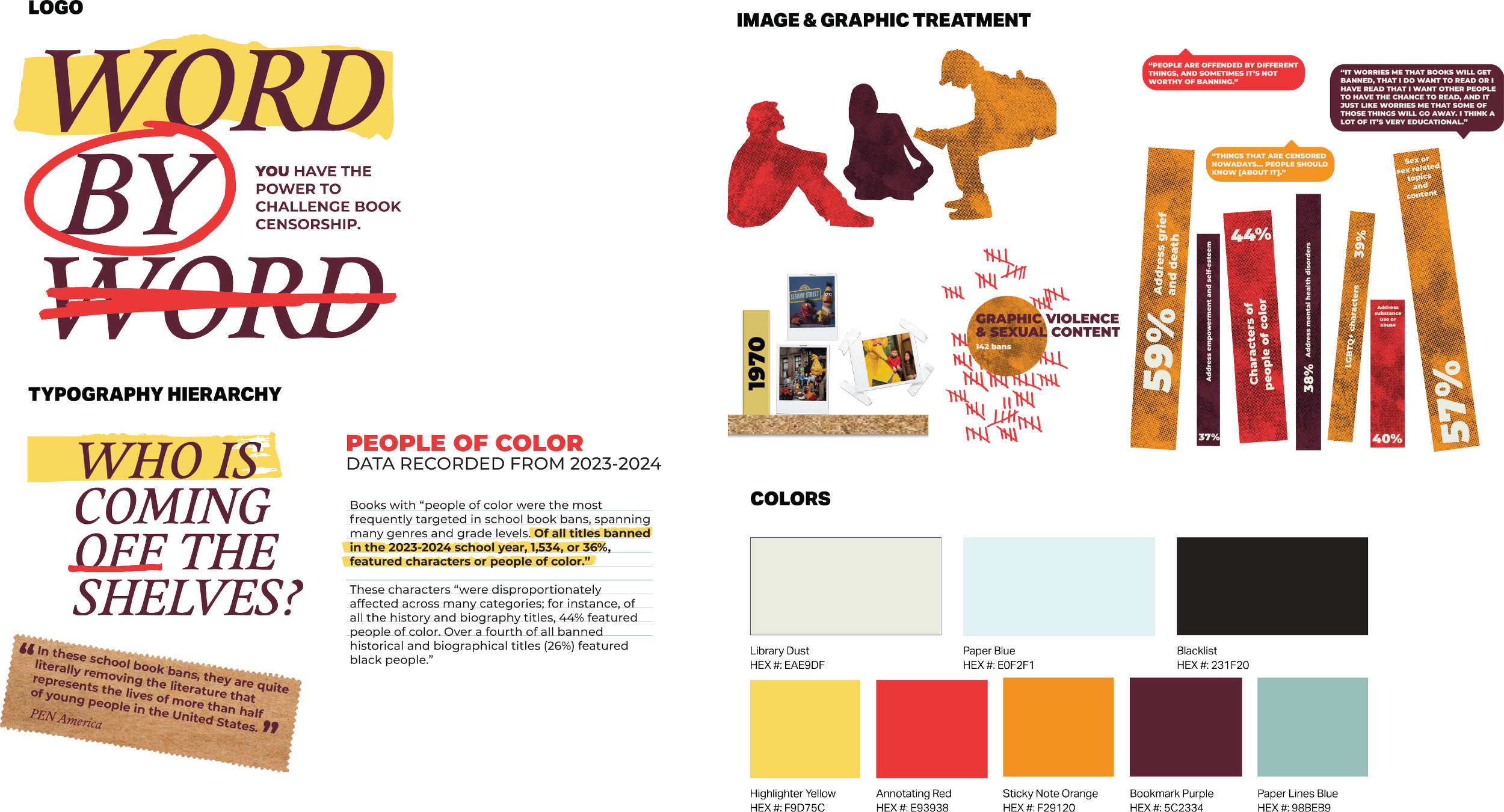
PROCESS: DESIGN SYSTEM
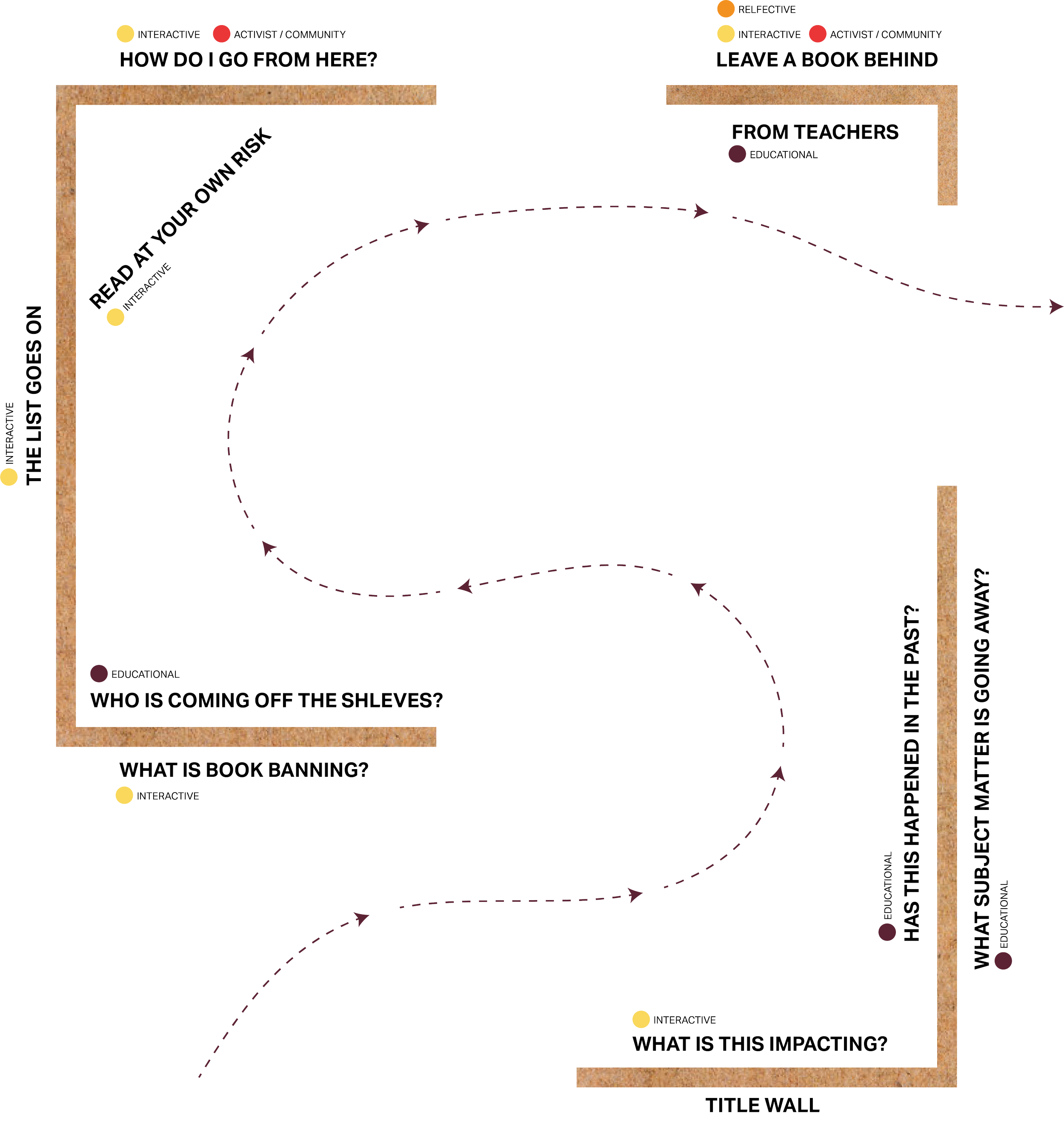
PROCESS: CREATING A WAYFINDING SYSTEM
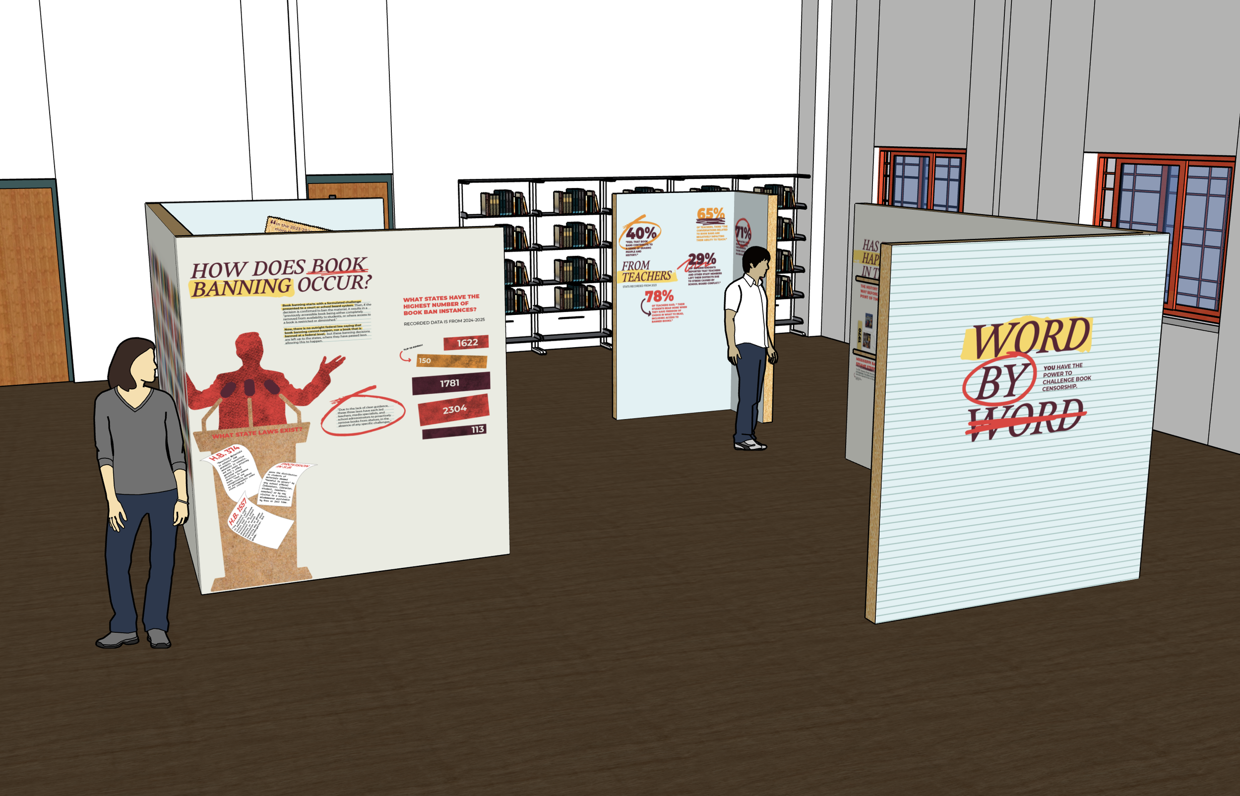
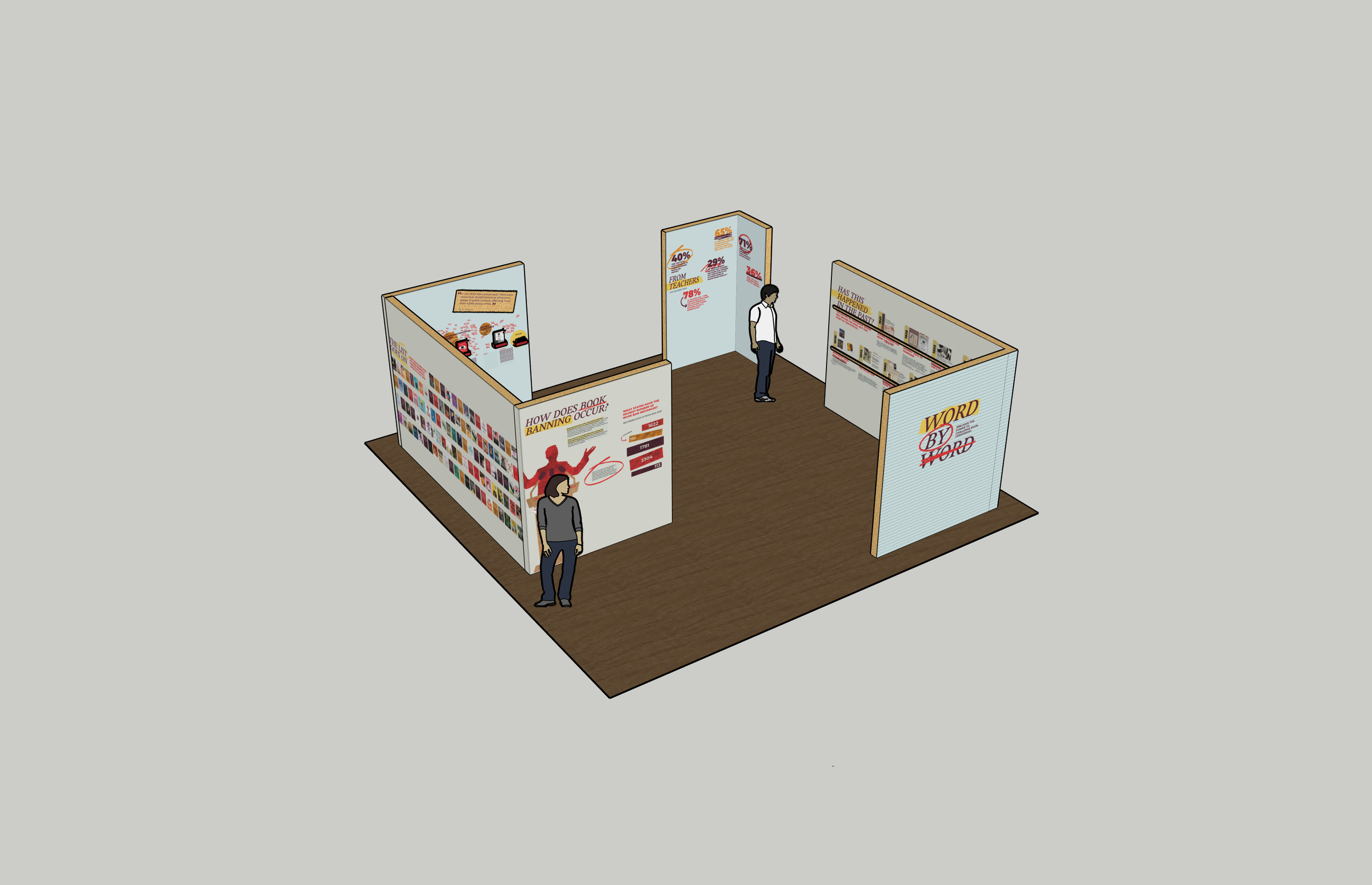
Shown below is a bird’s eye view of the space itself and where I decided to categorize my information.
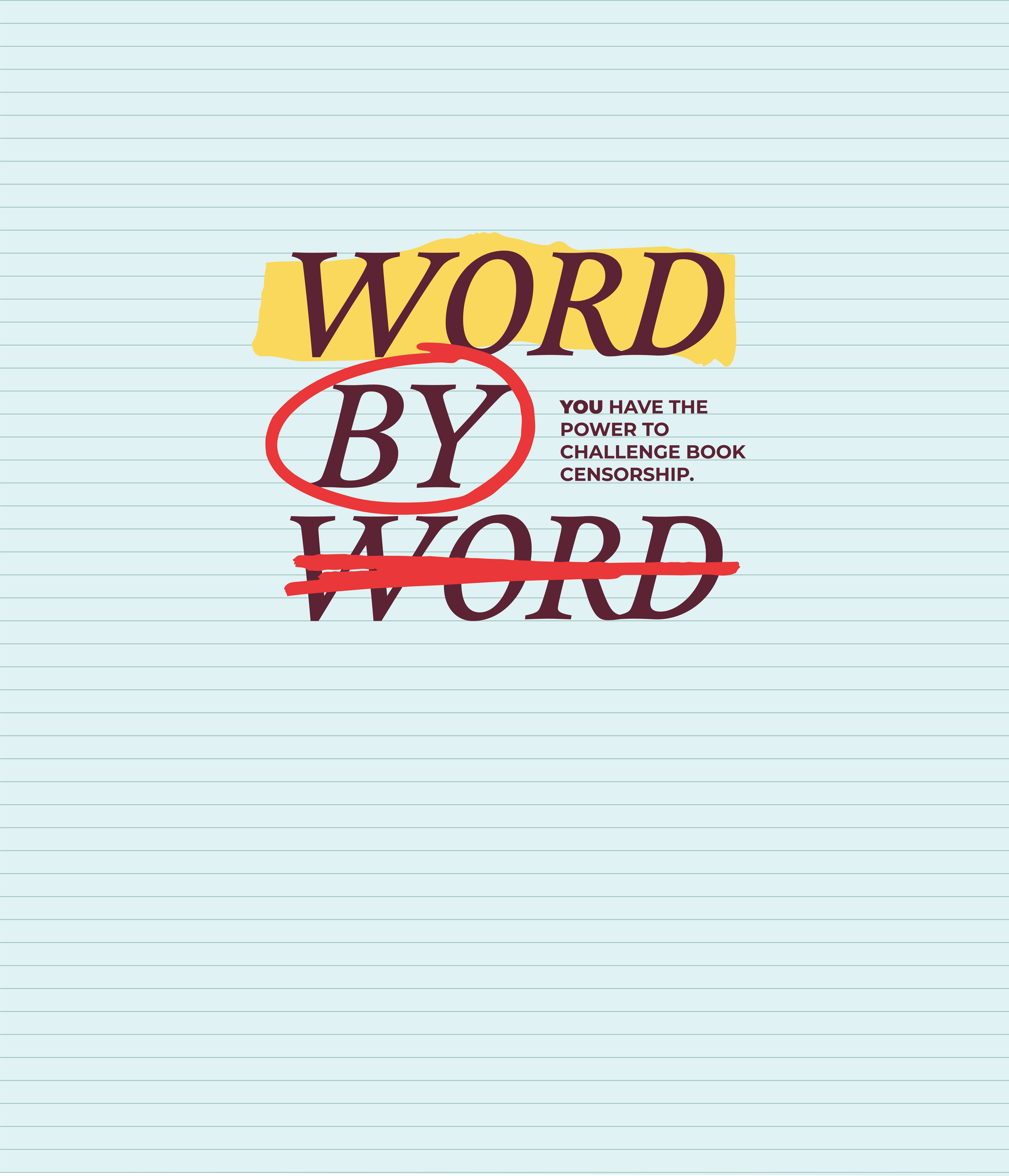
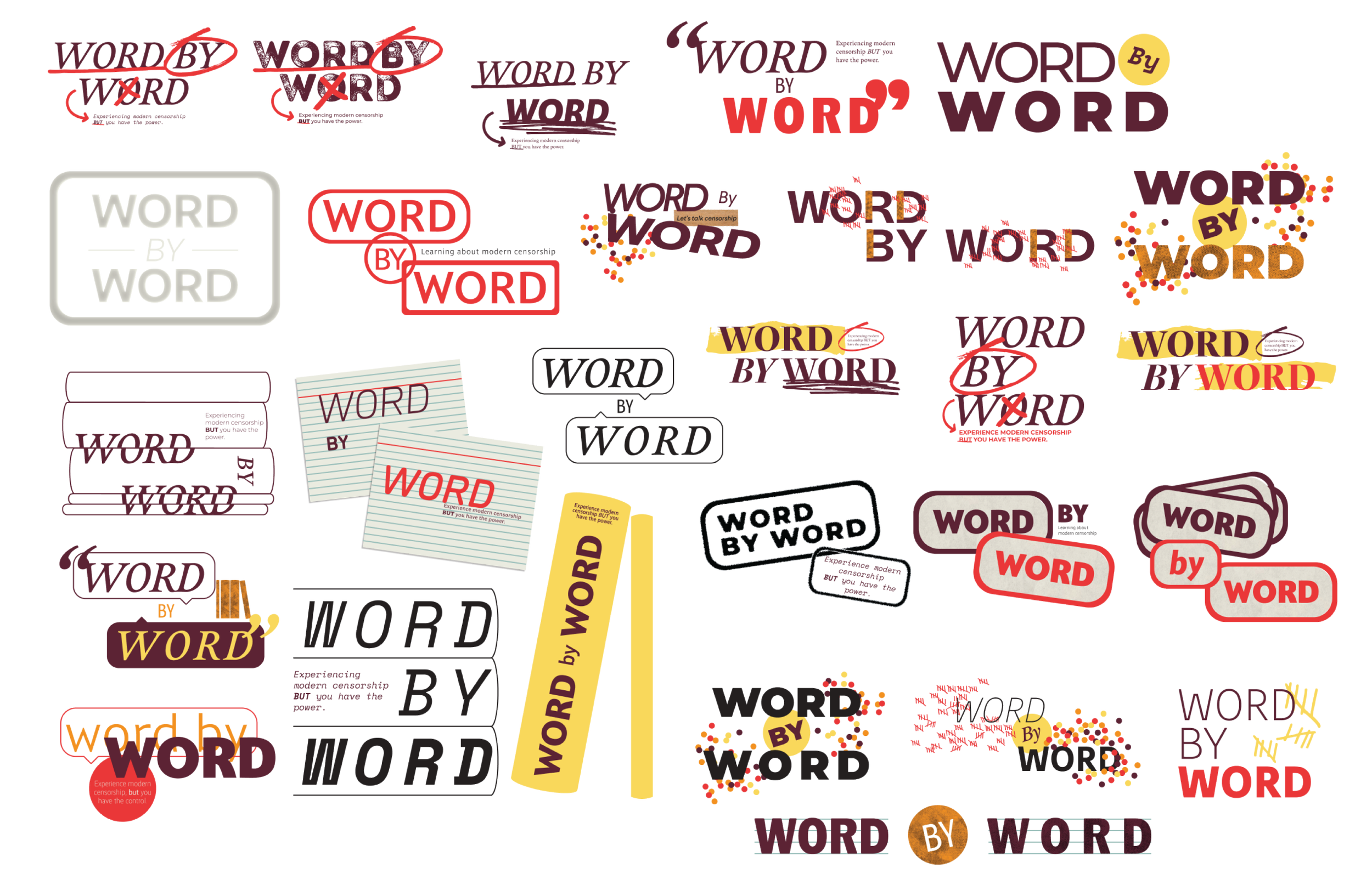
PROCESS: LOGO DESIGN
I tested out a variety of different ways I could go about this logo, from mimicking a book stamp, words taking on forms of books, bringing forward elements often seen throughout the exhibition, and this idea of altering or changing.
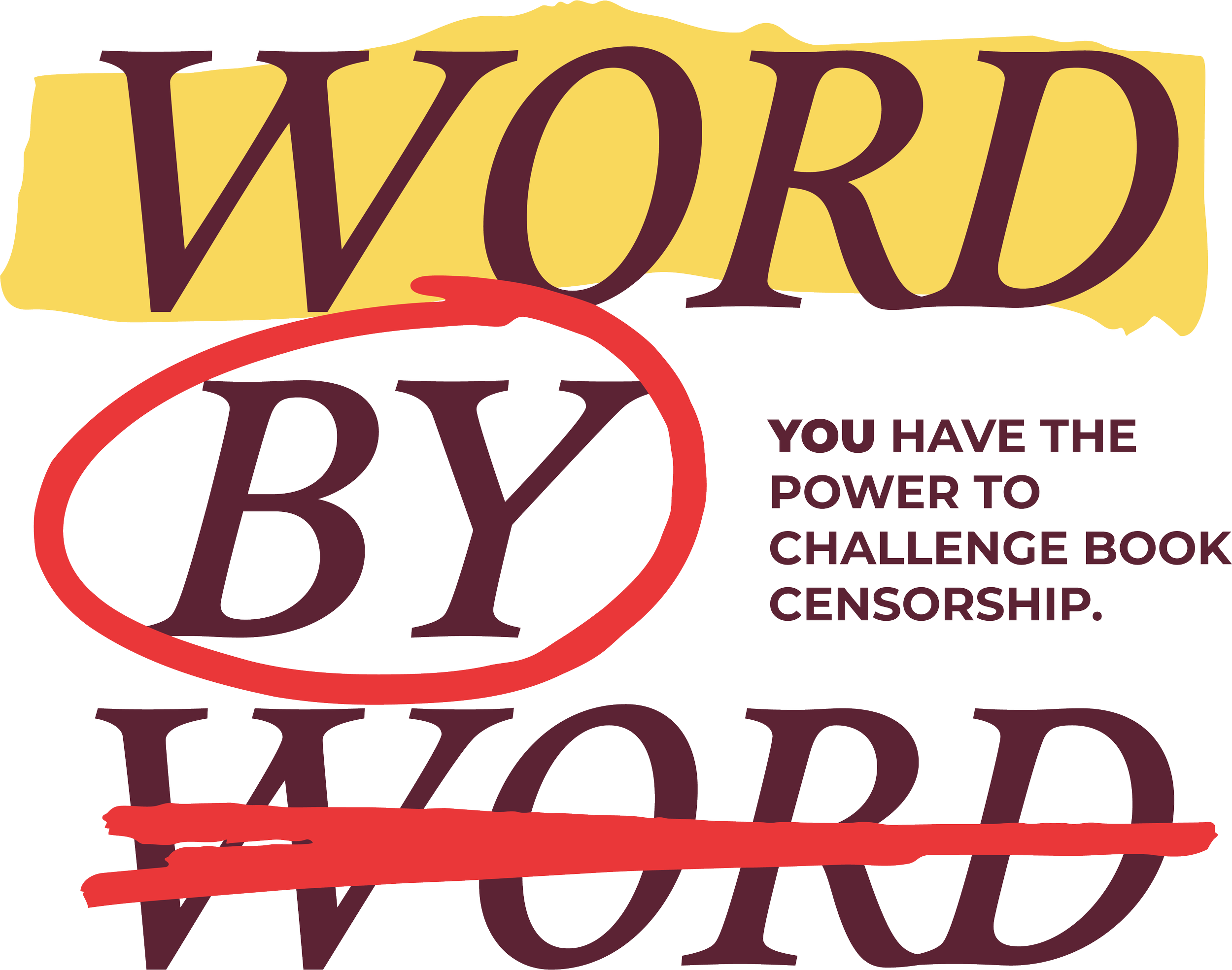
PROCESS: FINAL LOGO DESIGN
In my final logo, I really wanted to bring forward this experiment of representing an idea of annotating or the altering of text by using highlighting treatments, crossing things out, or circling. In using this kind of treatment, I felt that it really spoke to the fact that the issue of book censorship is always changing.
In addition to the structure of the logo itself, I went forward with all words stacked left-aligned in italic, as it represents the idea of a bookshelf and books leaning against each other.
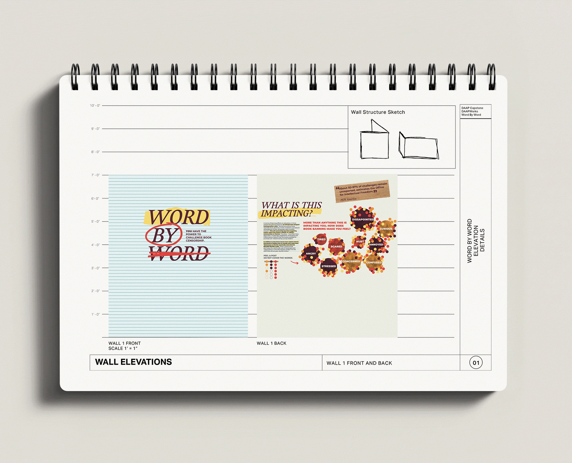
PROCESS: FINALIZED WALL ELEVATIONS
Scale 1’=1”
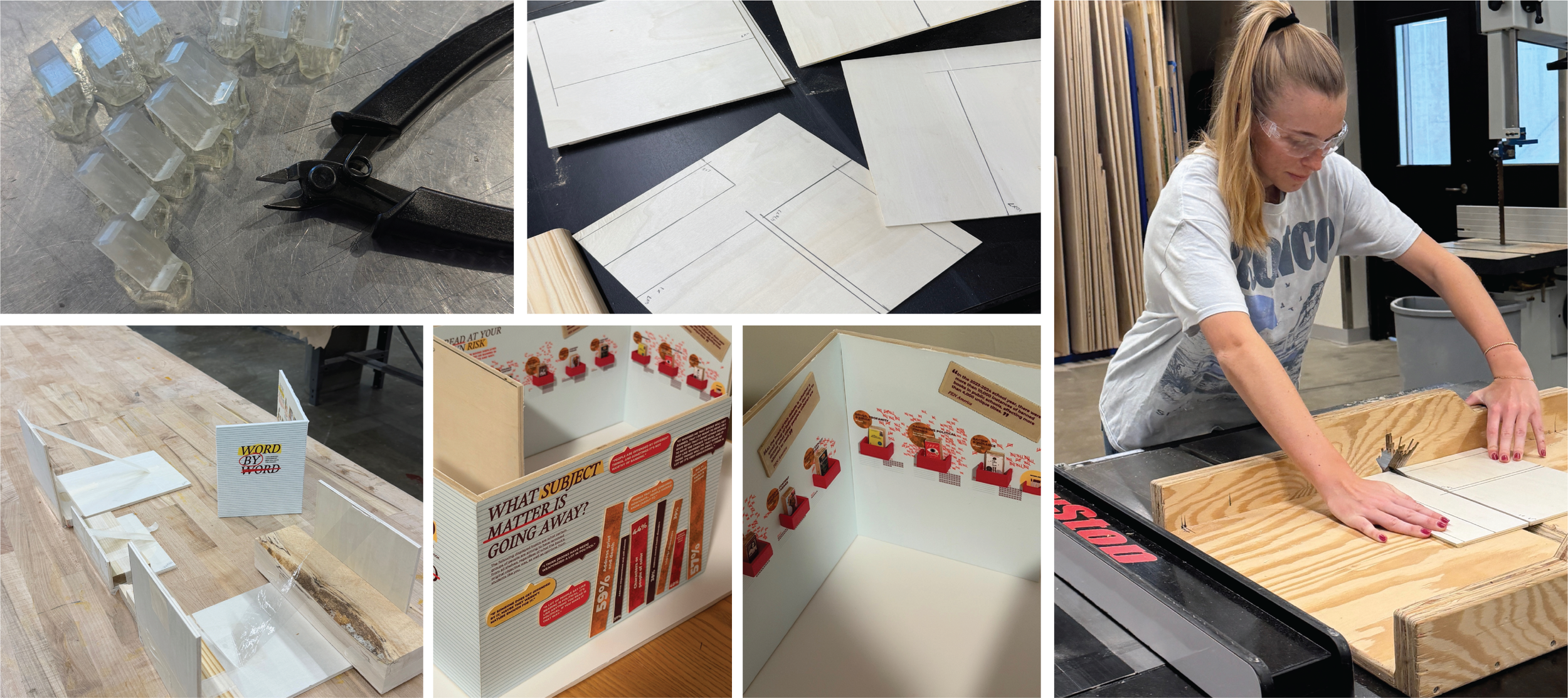
PROCESS: MODEL CONSTRUCTION
For precision and accuracy in my small-scale model of this exhibition, I crafted a lot of my material out of wood, 3D printed objects, and laser-cut components.
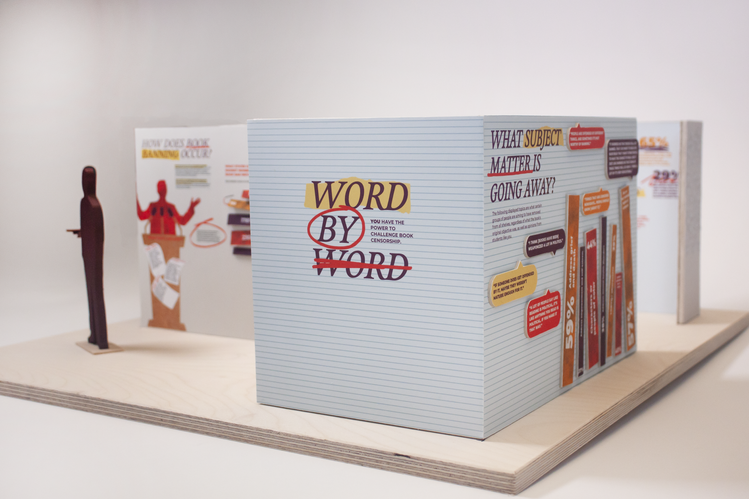
FINAL MODEL
FINAL SKETCHUP MODEL SCENES
In always looking at this exhibition at a smaller scale, I then took it upon myself to learn the functions of SketchUp to execute a full-scale version.